Visualization
Data visualization using Matplotlib and Seaborn in Python enables the creation of informative and visually appealing plots, charts, and graphs, facilitating the exploration, understanding, and communication of patterns, trends, and insights within data.
Goals
By the end of this lesson, you should be able to:
- Create scatter plot and other statistical plots like box plot, histogram, and bar plot.
scatter plot, line plot, pair plot, bar plot, box plot, histogram
In this lesson, we will discuss common plots to visualize data using Matplotlib and Seaborn. Seaborn works on top of Matplotlib and you will need to import both packages in most of the cases.
Reference:
First, let's import the necessary packages:
import pandas as pd
import matplotlib.pyplot as plt
import seaborn as sns
import numpy as np
We will still work with HDB resale price dataset to illustrate some visualization we can use. So let's import the dataset.
file_url = 'https://www.dropbox.com/s/jz8ck0obu9u1rng/resale-flat-prices-based-on-registration-date-from-jan-2017-onwards.csv?raw=1'
df = pd.read_csv(file_url)
df
Categories of Plots
There are different categories of plot in Seaborn packages as shown in Seaborn documentation.
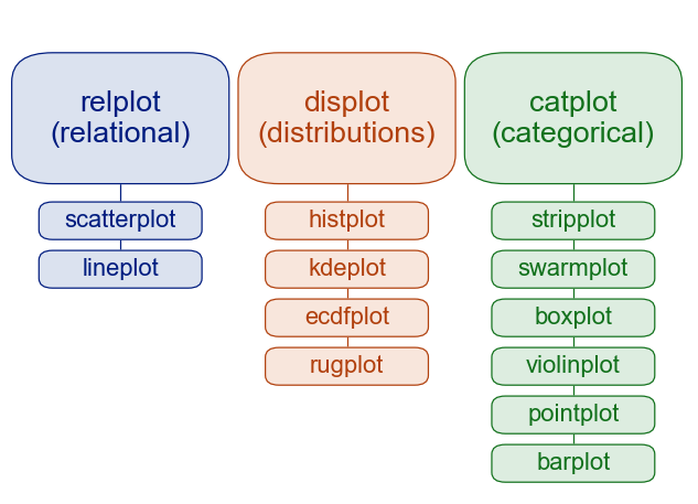
We can use either scatterplot or lineplot if we want to see relationship between two or more data. On the other hand, we have a few options to see distribution of data. The common one would be a histogram. The last category is categorical plot. We can use box plot, for example, to see the statistics of different categories. We will illustrate this more in the following sections.
Histogram and Boxplot
One of the first thing we may want to do in understanding the data is to see its distribution and its descriptive statistics. To do this, we can use histplot to show the histogram of the data and boxplot to show the five-number summary of the data.
Let's see the resale price in the area around Tampines. First, let's check what are the town listed in this data set.
np.unique(df['town'])
array(['ANG MO KIO', 'BEDOK', 'BISHAN', 'BUKIT BATOK', 'BUKIT MERAH', 'BUKIT PANJANG', 'BUKIT TIMAH', 'CENTRAL AREA', 'CHOA CHU KANG', 'CLEMENTI', 'GEYLANG', 'HOUGANG', 'JURONG EAST', 'JURONG WEST', 'KALLANG/WHAMPOA', 'MARINE PARADE', 'PASIR RIS', 'PUNGGOL', 'QUEENSTOWN', 'SEMBAWANG', 'SENGKANG', 'SERANGOON', 'TAMPINES', 'TOA PAYOH', 'WOODLANDS', 'YISHUN'], dtype=object)
Now, let's get the data for resale in Tampines only.
df_tampines = df.loc[df['town'] == 'TAMPINES',:]
df_tampines
Then, we can plot its resale price distribution using histplot.
See documentation for histplot
sns.histplot(x='resale_price', data=df_tampines)
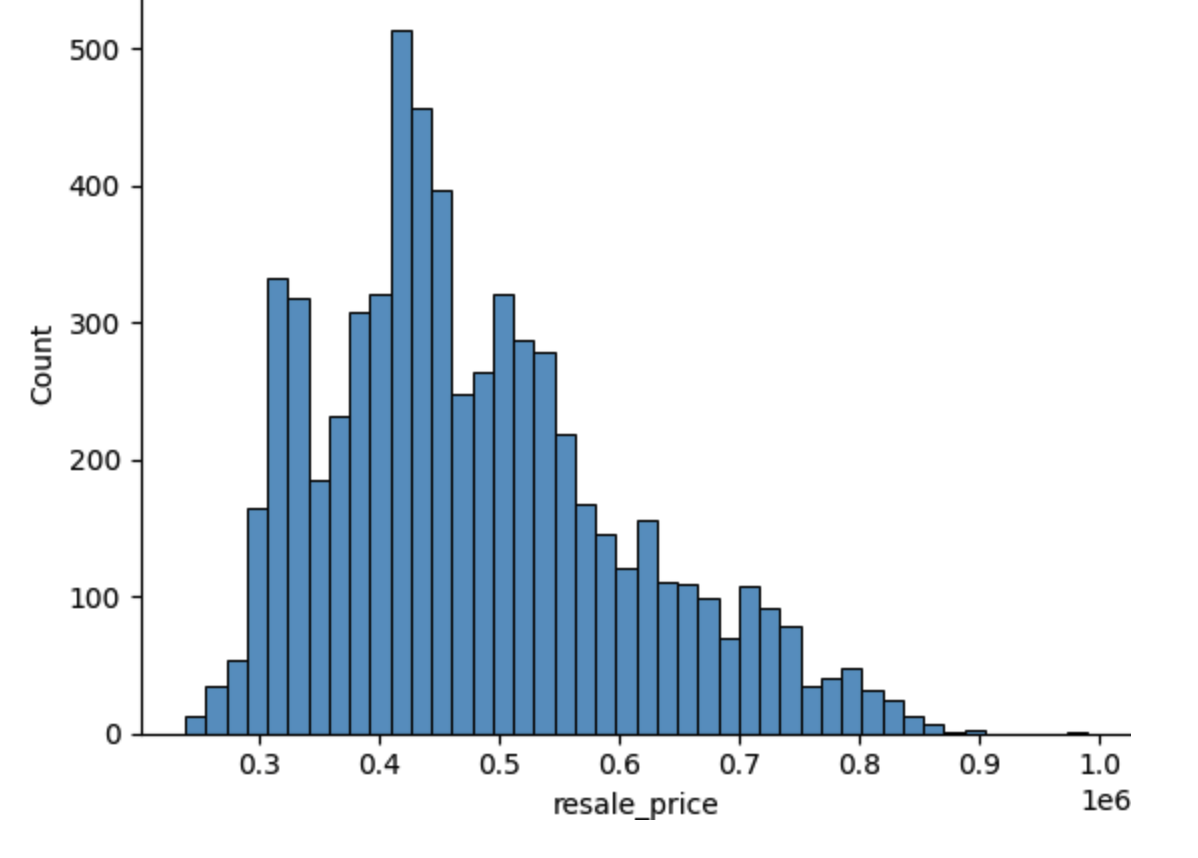
In the above plot, we use df_tampines as our data source and use resale_price column as our x-axis. We can change the plot if we want to show it vertically.
sns.set()
sns.histplot(y='resale_price', data=df_tampines)
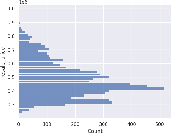
Notice that the background changes. This is because we have called sns.set() which set Seaborn default setting instead of using Matplotlib's setting. For example, Matplotlib uses whitebackground and no grid. Seaborn by default displays some white grid on gray background.
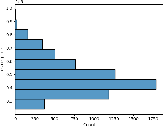
By default, the bins argument is auto and Seaborn will try to calculate how many bins should be used. But we can specify this manually.
sns.histplot(y='resale_price', data=df_tampines, bins=10)
We can see that majority of the sales of resale HDB in Tampines is priced at about $400k to $500k.
We can also use the boxplot to see some descriptive statistics of the data.
sns.boxplot(x='resale_price', data=df_tampines)

See Understanding Boxplot for more detail. But the figure in that website summarizes the different information given in a boxplot.

The box gives you the 25th percentile and the 75th percentile boundary. The line inside the box gives you the median of the data. As we can see the median is about $400k to $500k. The difference between the 75th percentile (Q3) and the 25th percentile (Q1) is called the Interquartile Range (IQR). This definition is needed to understand what defines outliers. The minimum and the maximum here is not the minimum and the maximum value in the data, but rather is capped at
Anything below or above these "minimum" and "maximum" are considered an outlier in the box plot. In the figure above, for example, we have quite a number of outliers on the high end of the resale price.
You can try exploring boxplot and histogram plot more in the livecode block below. Uncomment either one to plot different plots above yourself:
Modifying Labels and Titles
Since Seaborn is built on top of Matplotlib, we can use some of Matplotlib functions to change the figure's labels and title.
For example, we can change the histogram's plot x and y labels and its titles using plt.xlabel(), plt.ylabel(), and plt.title. You can access these Matplotlib's functions by first storing the output of your Seaborn plot.
myplot = sns.histplot(y='resale_price', data=df_tampines, bins=10)
Once you obtain the handle, you can call Matplotlib's function by adding the word set_ in front of it. For example, if the Matplotlib's function is plt.xlabel(), you call it as myplot.set_xlabel(). See the code below.
myplot = sns.histplot(y='resale_price', data=df_tampines, bins=10)
myplot.set_xlabel('Count', fontsize=16)
myplot.set_ylabel('Resale Price', fontsize=16)
myplot.set_title('HDB Resale Price in Tampines', fontsize=16)
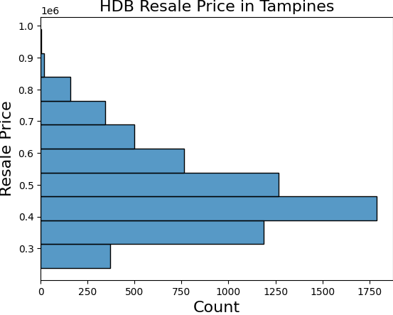
Notice now that the plot has a title and both the x and y label has changed.
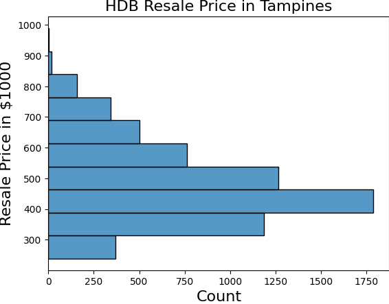
The above plot will be much easier if we plots in thousands of dollars. So let's create a new column of resale price in $1000.
df_tampines['resale_price_1000'] = df_tampines['resale_price'].apply(lambda price: price/1000)
df_tampines['resale_price_1000'].describe()
Now, let's plot it one more time.
myplot = sns.histplot(y='resale_price_1000', data=df_tampines, bins=10)
myplot.set_xlabel('Count', fontsize=16)
myplot.set_ylabel('Resale Price in $1000', fontsize=16)
myplot.set_title('HDB Resale Price in Tampines', fontsize=16)
Using Hue
Seaborn make it easy to plot the same data and colour those data depending on another data. For example, we can see the distribution of the resale price according to the room number or the storey range. Seaborn has an argument called hue to specify which data column you want to use to colour this.
myplot = sns.histplot(y='resale_price_1000', hue='flat_type', data=df_tampines, bins=10)
myplot.set_xlabel('Count', fontsize=16)
myplot.set_ylabel('Resale Price in $1000', fontsize=16)
myplot.set_title('HDB Resale Price in Tampines', fontsize=16)
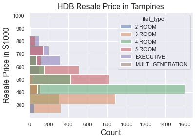
So we can see from the distribution that 4-room flats in Tampines contributes roughly the largest sales. We can also see that 4-room flat resale price is around the median of the all the resale flats in this area.
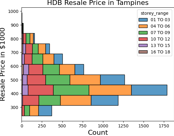
myplot = sns.histplot(y='resale_price_1000', hue='storey_range', data=df_tampines, bins=10)
myplot.set_xlabel('Count', fontsize=16)
myplot.set_ylabel('Resale Price in $1000', fontsize=16)
myplot.set_title('HDB Resale Price in Tampines', fontsize=16)
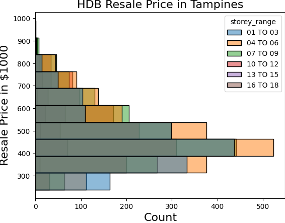
The above colouring is not so obvious because they are on top of one another, one way is to change the settings in such a way that it is stacked. We can do this by setting the multiple argument for the case when there are multiple data in the same area.
myplot = sns.histplot(y='resale_price_1000', hue='storey_range',
                      multiple='stack',
                      data=df_tampines, bins=10)
myplot.set_xlabel('Count', fontsize=16)
myplot.set_ylabel('Resale Price in $1000', fontsize=16)
myplot.set_title('HDB Resale Price in Tampines', fontsize=16)
You can try plotting the above yourself using livecode block below. Uncomment either block then run to view them:
What is this SettingWithCopyWarning?
This error came about because of this line: df_tampines = df.loc[df['town'] == 'TAMPINES',:]. In the next line, you're attempting to change df_tampines['resale_price_1000' which can possibly just be a "copy" (a "view") of the original dataframe.
In this case we are not doing a chained assignments so it's okay to do it and this warning is simply a false positive. However it might be dangerous to do so at other times, especially if you meant to modify the original dataframe with chained assignments like df_tampines.loc[917]['town'] = "NEW_TAMPINES", as this will not modify df_tampines at all since you're applying the change on a "view": df_tampines.loc[917]. A correct way will be to apply the change as a single assignment: df_tampines.loc[917, 'town'] = "NEWTAMPINES".
Give this article a read, and also this article.
You can try to silence the warning it by using
copy:df_tampines = df.loc[df['town'] == 'TAMPINES',:].copy(). This way you explicitly create a new dataframe calleddf_tampines.
Scatter Plot and Line Plot
We use scatter plot and line plot to visualize relationship between two or more data. For example, we can plot the floor area and resale price to see if there is any relationship.
myplot = sns.scatterplot(x='floor_area_sqm', y='resale_price_1000', data=df_tampines)
myplot.set_xlabel('Floor Area ($m^2$)')
myplot.set_ylabel('Resale Price in $1000')
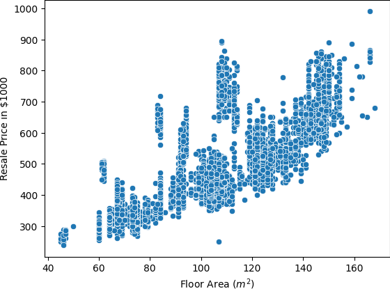
As we can see from the plot above, that the price tend to increase with the increase in floor area. You can again use the hue argument to see any category in the plot.
myplot = sns.scatterplot(x='floor_area_sqm', y='resale_price_1000',
                         hue='flat_type',
                         data=df_tampines)
myplot.set_xlabel('Floor Area ($m^2$)')
myplot.set_ylabel('Resale Price in $1000')
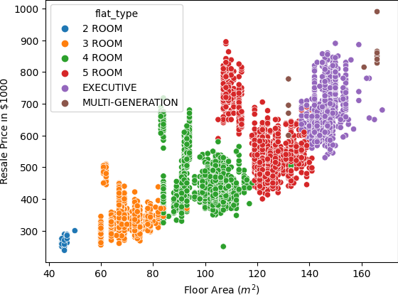
We can see that flat type in a way also has relationship with the floor area.
Pair Plot
One useful plot is called Pair Plot in Seaborn where it plots the relationship on multiple data columns.
myplot = sns.pairplot(data=df_tampines)
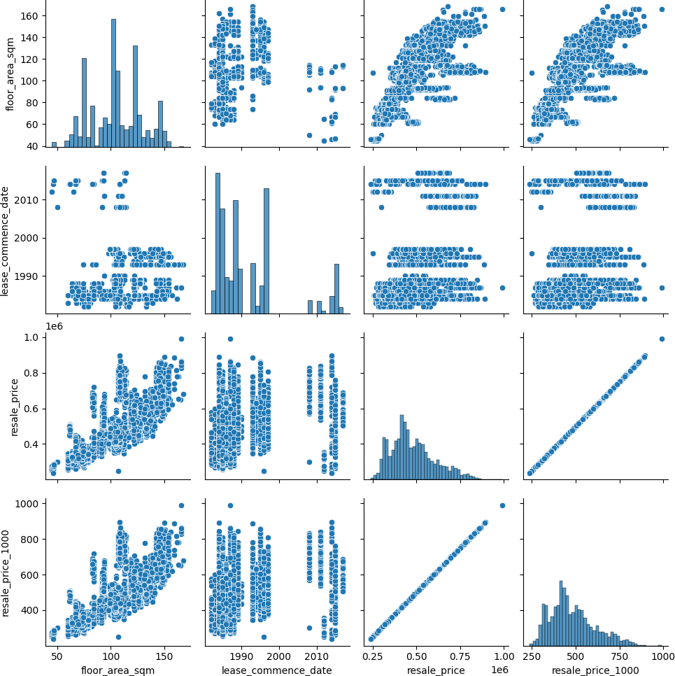
The above plots immediately plot different scatter plots and histogram in a matrix form. The diagonal of the plot shows the histogram of that column data. The rest of the cell shows you the scatter plot of two columns in the data frame. From these, we can quickly see the relationship between different columns in the data frame.
You can try to plot scatterplot and pair-plot yourself in the livecode block below: